There is a strange habit in business. When revenue stalls, the instinct is to overhaul everything. New logo. New color palette. Complete structural rebuild. Six months and tens of thousands of dollars later, the numbers look eerily similar.
The problem was never the visual design. It was the handful of friction points no one bothered to measure.
A/B testing offers a more surgical and far more affordable path to growth. It isolates the specific elements causing visitors to leave and provides evidence for what actually works. Whether you work independently as a website designer or operate within a web design company serving multiple clients, split testing transforms design from an art project into a disciplined optimization process.
What Split Testing Actually Involves
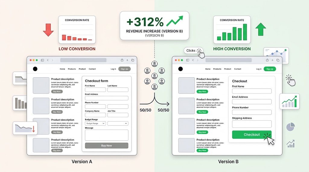
Strip away the jargon and you have a simple comparison. You create two versions of a page. One remains your current live version — researchers call this the control. The other contains a single deliberate modification — known as the variant.
Your incoming traffic gets divided between them. Each visitor encounters only one version, and their interactions are recorded separately. After accumulating enough data, you compare the two and identify which version moved the needle.
It operates much like a scientific experiment. You change one thing, observe the result, and draw a conclusion grounded in evidence. No politics. No assumptions. Just measurable differences in how real people respond to real changes on your site.
The Overlooked Impact of Micro-Adjustments
Here is what most people miss. The changes that produce the steepest revenue increases are typically the ones that feel insignificant on the surface. A complete redesign can feel satisfying creatively, but it introduces so many simultaneous changes that isolating what actually improved becomes nearly impossible.
User behavior, on the other hand, is extraordinarily sensitive to detail. A visitor scanning your page makes dozens of micro-decisions per second — whether to keep reading, whether to scroll, whether to trust what they see. Friction at any of those decision points can redirect them off your site permanently.
A seasoned website designer understands that the real work is not making pages look beautiful. It is identifying the two or three specific barriers standing between a visitor and a completed transaction, then systematically removing them.
Run the numbers on a concrete scenario. Say your site attracts 15,000 visitors monthly and converts 2% into paying customers. That yields 300 sales. Now imagine that refining your checkout flow — perhaps by removing one unnecessary confirmation step — pushes your conversion rate to 2.6%. You are now processing 390 sales from the same visitor pool. A 30% jump in revenue, originating from a change that took less than an afternoon to implement and test.
A Practical Walkthrough for Your First Test
You do not need sophisticated infrastructure or specialized talent. The process is accessible to almost anyone with a website and basic analytics access.
Step 1: Study your data before making changes.
Identify where your conversion funnel is leaking. Tools like Google Analytics reveal which pages attract the most traffic and which ones fail to convert that traffic into action. A cart page with extremely high abandonment rates tells you exactly where to focus your energy.
Step 2: Write a specific, testable prediction.
Vague intentions produce vague results. Rather than “I want to test the homepage,” articulate something measurable: “Changing the hero section headline from a feature description to a benefit statement will increase click-through to the pricing page by at least 10%.” Precision gives your experiment a clear finish line.
Step 3: Modify exactly one element.
The power of a split test lies in its simplicity. If you change the headline, the background color, and the navigation layout all at once, any resulting shift in performance becomes untraceable. Discipline in isolating variables is what makes the data trustworthy.
Step 4: Exercise patience during the testing window.
Four days is rarely enough data to draw reliable conclusions. Visitor patterns shift across weekdays and weekends. A web design company running tests for a B2B client, for instance, might need to capture several weeks of weekday traffic before reaching confident results, since their audience is largely inactive on weekends. Let your testing platform tell you when statistical significance has been reached rather than imposing an arbitrary deadline.
Step 5: Act on what the data demonstrates.
When confidence levels hit the 95% threshold, commit to a decision. Make the winning version your new standard. If neither version showed a meaningful advantage, document that finding and redirect your attention toward a different area of the funnel with greater room for improvement.
Four Categories of Changes Worth Testing First
Certain types of adjustments consistently produce measurable performance differences. Prioritizing these areas gives you the highest probability of early wins.
The language on your primary buttons and links.
Labels like “Submit,” “Enter,” or “Click Here” provide zero context about what follows. Replacing them with value-oriented language — “Get Your Custom Report,” “Start My Free Trial,” “Claim Your Discount” — sets clear expectations. One well-known experiment swapped “Create Account” for “Continue” and observed a significant lift in sign-up completions. The shift in phrasing lowered the psychological barrier to taking the next step.
The number of fields in your forms.
This is one of the most reliable findings in all of conversion research. Every additional field you require creates an additional moment of hesitation. A form requesting a phone number, mailing address, and department name will hemorrhage completions compared to one asking solely for an email. Strip your forms to the bare essentials and measure the effect on your completion metrics.
The imagery you use across your pages.
Generic stock photography has become so pervasive that most visitors process it as visual filler. Images of people in business attire shaking hands or pointing at transparent screens have lost all persuasive power. Exchanging a generic image for an authentic photograph — your actual team, your real product in use, your physical workspace — creates a tangible impression of credibility. Authenticity resonates in ways that polished stock imagery does not.
The structure of your pricing or plan comparison page.
When prospects face a dense feature list with every option given equal visual emphasis, decision fatigue sets in quickly. Testing a layout that highlights one option as the recommended choice — positioned between a basic and premium tier — simplifies the evaluation process. The highlighted option gains an anchoring advantage, and conversion rates for that tier often improve significantly as a result.
Common Errors That Produce Misleading Results
Split testing is methodologically simple, which paradoxically makes it easy to execute poorly. Watch for these recurring mistakes.
Changing too many things in a single test.
Multivariate testing — where multiple elements vary across different combinations — requires enormous visitor volumes to yield statistically sound conclusions. A Singapore website designer managing a site for a local service business will not have the traffic density needed. Single-variable experiments remain the most practical and interpretable approach for the vast majority of situations.
Stopping tests before reaching statistical significance.
This is the single most damaging mistake. A variant takes an early lead after two days, someone declares it the winner, and the test is terminated. Early results are inherently unstable. They may reflect the behavior of a narrow audience segment rather than your broader visitor population. Always wait for your testing tool to confirm that the result holds at the 95% confidence level before making any permanent changes.
Failing to extract lessons from underperforming variants.
A test result where the original design wins is not a failure — it is a confirmation. You now possess concrete evidence that the original approach outperformed the alternative in that specific context. That knowledge prevents wasted effort on similar changes in the future and helps you allocate your testing calendar more strategically going forward.
Looking Ahead
Static websites lose ground continuously. The businesses that treat their digital presence as a living, evolving system consistently outperform those that treat it as a completed project.
Adopting a testing mindset does not require dramatic investment. It requires a simple commitment: test one thing, learn from it, apply the lesson, and repeat. Over weeks, these small disciplined actions compound into meaningful competitive advantages.
The next time a design disagreement stalls a decision in your workplace, the answer does not require more debate. Propose a test. Let real visitor behavior settle the question. That single shift in approach — from argument to experiment — changes everything about how your team progresses.